Portfolio · UX Systems Design
Good design systems make the interface disappear.
When structure, visual hierarchy, and interaction patterns work together, users don't notice the system — they just move. These projects show the decisions behind that invisibility.
How I approach UX systems design
A set of decisions — about hierarchy, interaction, visual weight, and cognitive load — that scale across every screen. My work builds those systems from the ground up, iteration by iteration, until the interface gets out of the user's way.
The Problem
Good intentions, no hierarchy
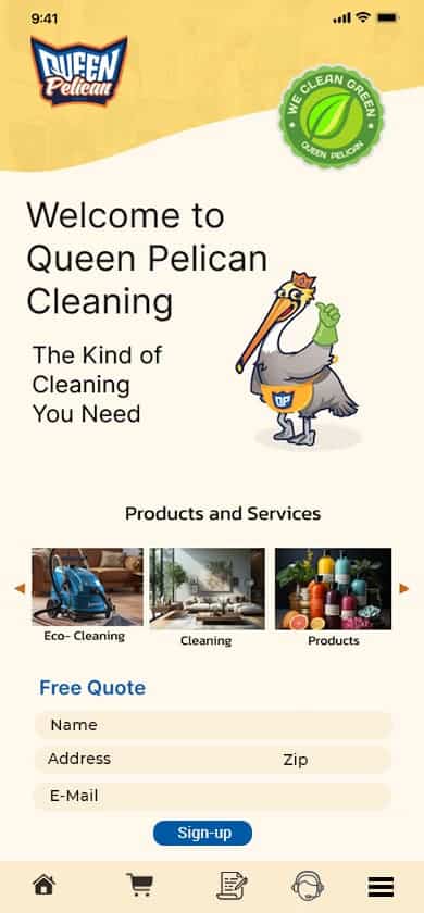
The original design made everything visible — Sign Up, Log In, Chat, all services at once. The intention was to reduce friction. Without research to back it up, equal-weight choices created decision paralysis before the user could orient themselves.
The System Work
Three iterations, one clear direction
From paper sketch to yellow desktop iteration to the 2025 final design — each pass reduced friction. The onboarding flow was eliminated entirely. Navigation moved to a side menu. The home screen became a single, clear choice architecture.
The Outcome
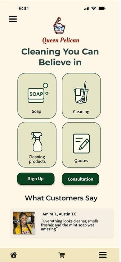
A system that lets the user lead
The 2025 final design gives users four immediate paths — Soap, Cleaning, Cleaning Products, Quotes — with Sign Up and Consultation as secondary actions. No onboarding. No overload. The system disappears.
Why hierarchy was the hardest design decision
Prioritizing some actions over others means making a judgment call about what users need most. Removing the onboarding flow meant trusting the user to navigate from screen one. Moving navigation to a side menu meant deprioritizing visible options in favor of a cleaner primary experience. Every subtraction required confidence in the research — that the card sort and usability findings were strong enough to justify the tradeoff.

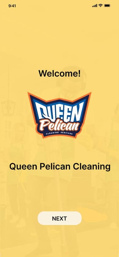
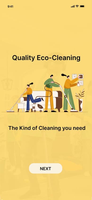
Original Sketch
The concept started on paper. Layout, navigation structure, and quote form roughed out by hand before any digital tool was involved.
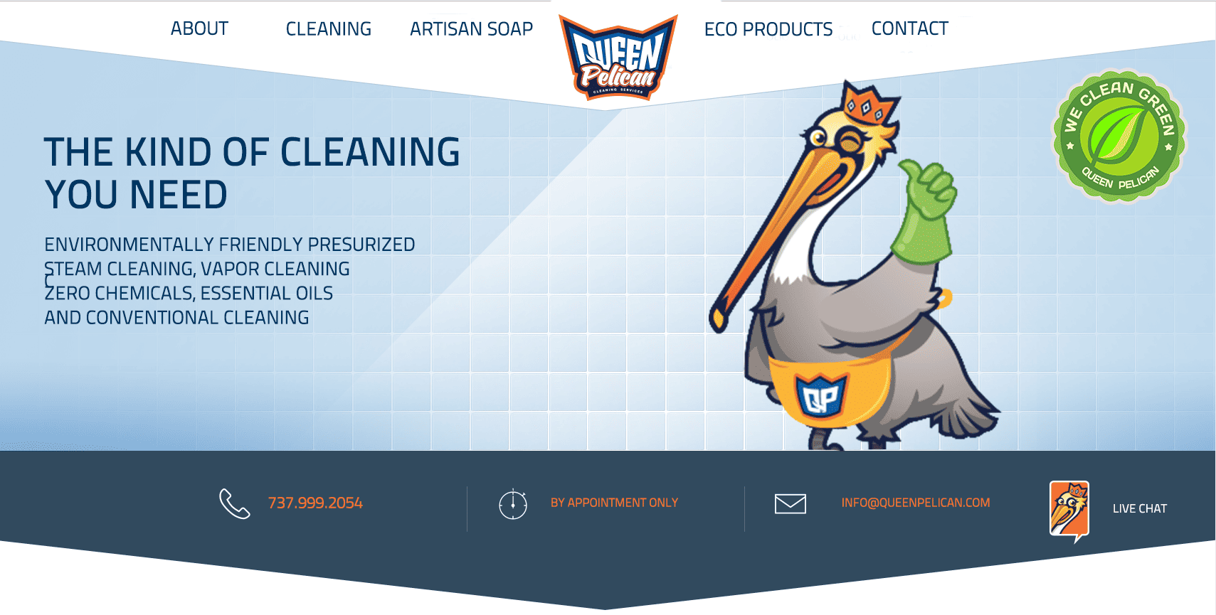
Desktop v1 — Original Landing
Built on the assumption that visible options reduce friction — Sign Up, Log In, Chat, and all services immediately accessible. The intention was right. What research revealed was that equal-weight choices without hierarchy created decision paralysis before the user could take a single action. Notably, this version included a live chat feature — forward-thinking for its time.
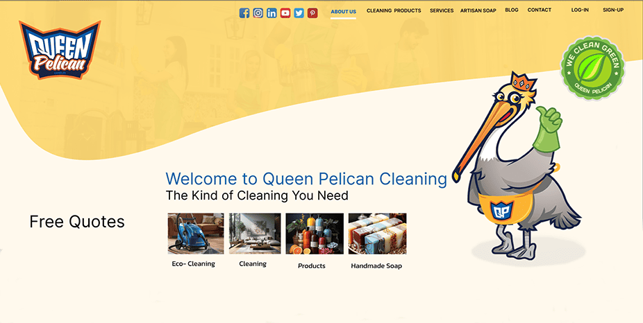
Desktop v2 — Yellow Iteration
The brand palette took shape. Layout improved, but hierarchy issues and onboarding friction remained. Still not resolved.
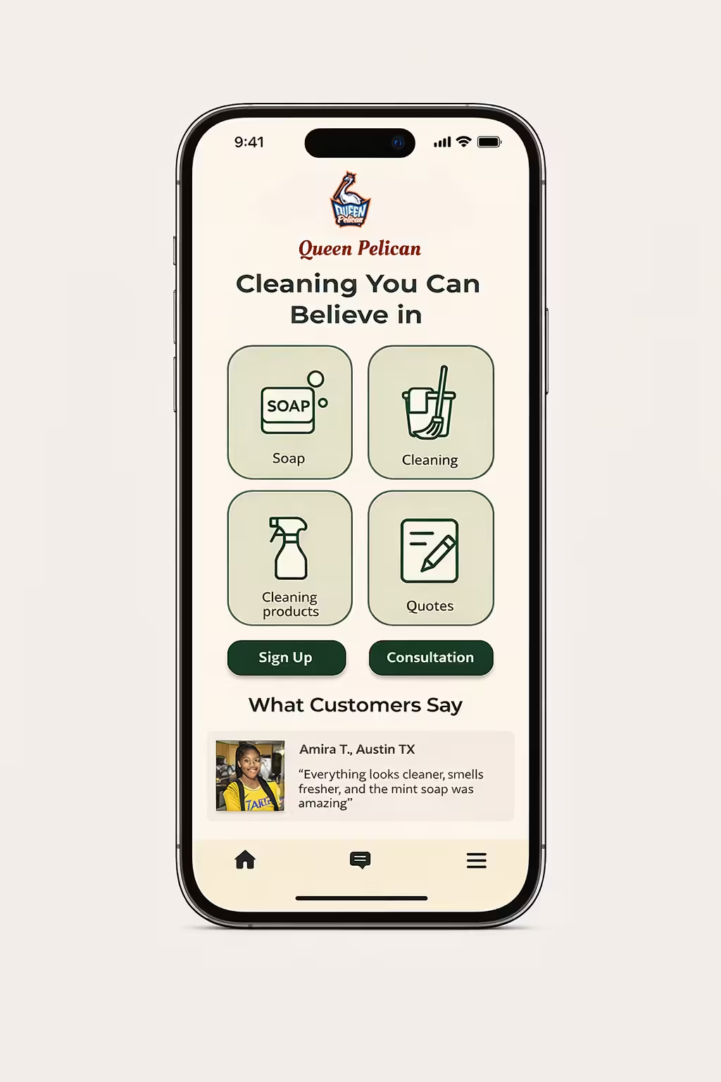
Final Design
Onboarding removed entirely. Four clear primary paths. Side navigation. After 8 years of iteration, the system finally disappears and the user leads.
The through-line
"The best design system is the one the user never has to think about."
Queen Pelican's evolution from sketch to final shows what iterative systems design actually looks like — not a single inspired solution, but a series of deliberate subtractions until only the essential remains.