Keto Me
A Coaching & Community-First Keto App
For women who haven't found lasting success in traditional programs.
Keto Me was created to support women — especially women of color — who have struggled to complete traditional weight loss programs and maintain their results. The data is clear: nearly 72% of people trying to lose weight never achieve meaningful, lasting results. Standard programs were not built for everyone.
Keto Me offers a coaching-first, community-centered approach that adapts to diverse dietary needs — vegetarian, vegan, diabetic-friendly, and culturally specific foods like Indian cuisine — and provides the accountability and real-food flexibility other programs lack.
This case study documents the full UX process: discovery research, problem definition, affinity mapping, app organization, hi-fi prototyping, and usability testing — showing how every design decision maps back to real user needs.
How do we design a keto lifestyle app that reduces friction in tracking while simultaneously building the community infrastructure that keeps users engaged long after the first week?
Five goals shaped every design decision — drawn directly from research, business requirements, and the gaps identified in existing keto apps.
Onboarding to Coach in Under 3 Minutes
- Connect every new user to a personalized coach before they log their first meal
- Coach discovery is open to all users from day one
Navigation Built Around How Users Think
- Replace assumption-based features with four sections that match what users actually need
- Coaching · Community · Recipes · Scan Food
Break the 30-Day Dropout Pattern
- Build peer support, accountability partners, and local groups into the core structure
- Address the 80% abandonment rate with community infrastructure
Reach Underserved Markets
- Target women of color ages 30–55 in Austin, Houston, and Atlanta
- Design for diverse health needs — diabetics, vegans, chronic conditions
Accessibility Built Into Every Screen
- ADA/WCAG AA compliance designed in from day one
- Every user, every screen, full access
The weight loss industry has shifted toward medications, procedures, and impersonal apps. The numbers tell a clear story: most people still don't reach their goals. And for women of color — especially Black and Latina women — standard programs consistently fall short, producing results well below clinical targets.
The women Keto Me was built for deserve a program designed around their real lives, their cultural needs, and genuine human support.
- Nearly 3 out of 4 people who try to lose weight never achieve clinically meaningful results
- For Black women, standard programs produce only 2–3% weight loss — well below the 5–10% clinical target
- Black adults have the highest obesity rate at 49.9%, Latino adults at 45.6% — communities that deserve programs built with them in mind
- The industry has moved toward pills and procedures — Keto Me moved toward community, coaching, and cultural relevance
- What people have always needed: accountability, real human support, and food that fits their actual lives
of people trying to lose weight never achieve meaningful, lasting results — CDC 2024
of Black women in the U.S. are obese — and standard programs largely fail to meet their needs
in annual medical costs related to obesity in the U.S. — the industry is growing, not solving
average weight loss Black women achieve in standard programs — far below the 5–10% clinical target
Problem Statement
Women — especially women of color — need a weight loss approach built around their real lives, their cultural needs, and genuine human support. Standard programs weren't designed for them, and the data shows it. Keto Me was designed to change that.
Before designing anything, I needed to validate whether the "support gap" matched what real users experienced. I conducted a survey with 14 respondents — current or former keto lifestyle participants — then grouped findings through affinity mapping to find patterns in what people said, felt, and needed.
The Double Diamond strategy shaped the research process: Discover → Define → Develop → Deliver, with iteration loops at each stage.
Research Methods
- Online survey — 14 participants (current/former keto users)
- Affinity mapping to cluster themes across needs, frustrations, and desires
- Competitive analysis of existing keto and wellness apps
- Business requirements analysis aligned to SMART objectives
- Double Diamond methodology — Discover, Define, Develop, Deliver
Survey respondents — current and former keto lifestyle users
Patterns identified through affinity mapping — what people needed, wanted, and felt
Core user personas: community seeker, goal-driven, accountability-focused
of participants expressed interest in community or coaching
Affinity mapping revealed that users' stated requests (features) were often proxies for deeper needs (feelings and behaviors). Separating needs from wants was critical to avoid building an over-featured app that satisfied no one deeply.
Needs — Functional Essentials
- Simple, fast food tracking
- Personalized dietary guidance for their specific health context
- Access to a qualified coach or nutritionist
- Accountability — someone who notices when they slip
- Content that addresses emotional eating and cravings
- ADA-accessible interface usable across all ability levels
Wants — Engagement Drivers
- Community groups organized by health goals and lifestyle
- Peer-to-peer buddy systems and progress sharing
- Local in-person meetups and library wellness events
- Barcode scanning for fast product lookup
- Recipe discovery with keto-verified filtering
- Milestone celebrations and shared wins
Key Insight
Affinity mapping showed three clear patterns in what people said: wanting community, needing help with specific goals, and wanting accountability from a coach. Each pattern pointed to a different entry point in the app — which is exactly how the four main sections were designed.
Possible Solutions
Try Before You Commit
Add a trial feature that lets users explore the app and connect with a coach before committing — reducing hesitancy on a big lifestyle decision.
User-Controlled Coach Selection
Give users control over coach selection based on their specific needs, goals, time zone, and focus area — so the match feels right from day one.
In-App Community Support
Create a community where users get peer support when they feel like giving up — because the hardest moment is when results haven't arrived yet.
Three user types emerged from research. Brenda represents the primary persona — the community-seeker whose success depends on connection, not just data.

Brenda
Healthcare Admin · Austin, TX
Primary Persona- Baby Boomer · Divorced · Managing diabetes through diet
- Started keto after a doctor's recommendation; stopped three months in
- Relies on phone for communication — values accessibility and ease
- Connect with other diabetic keto users who understand her specific challenges
- Find a regional community she can join for local and digital support
- Have a coach available when cravings and setbacks hit
- Existing apps feel clinical — no warmth, no community
- No one checks in when she falls off the plan
- Generic keto advice doesn't account for her diabetes management needs
"As an overweight diabetic, I want to connect with other diabetics in the Keto Community so that I get support among people who understand this health challenge."
Design impact: Led to diabetic community groups in the Community pillar.
All Three Personas
Each persona represents a distinct entry point and emotional need within the app.
Brenda · Community Focus
Baby Boomer · Diabetic · Wants peer support from people who understand her health challenges
Pain point: Generic keto advice ignores her diabetes management needs entirely.
→ Led to diabetic community groups

Pam · Goal-Driven
Millennial · Vegan business owner · Needs keto-aligned recipes and grocery guidance
Pain point: No keto app offers vegan recipes with cultural diversity — she's invisible to the market.
→ Led to vegan recipe filters

Jackelle · Accountability
Gen X · Married business owner · Needs a coach to build accountability and structure
Pain point: She knows she needs a coach but has no structured way to find one that fits her schedule and goals.
→ Led to coach matching in onboarding
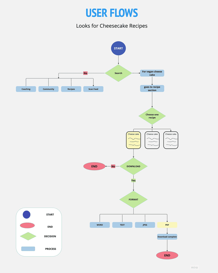
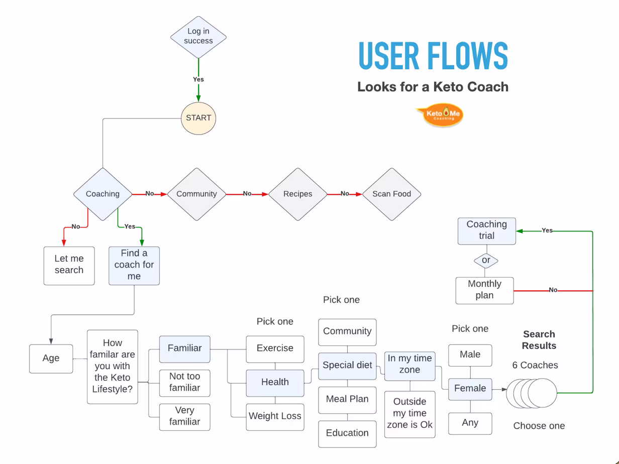
Three user flows map the critical paths through the app — each anchored to a distinct persona and a specific goal. These flows validated the four-pillar navigation structure and revealed exactly where decision points had to live.
Brenda — Find a Diabetic Group
Baby Boomer · Diabetic · Community-Seeker
"As an overweight diabetic, I want to connect with other diabetics in the Keto Community so that I get support among people who understand this health challenge."
Task Flow- 1 Entry: Log-In Success
- 2 Goes to Community section
- 3 Joins a community by region
- 4 Selects the Health section
- ✓ Finds the Diabetic group and joins

Pam — Find a Keto Recipe
Millennial · Vegan Business Owner · Goal-Driven
"As a vegan, I want to be able to make the right choices when grocery shopping, so I have a guideline that adheres to the Keto standards."
Task Flow- 1 Entry: Goes to Search
- 2 Types "Vegan Cheesecake recipe"
- 3 Search returns 3 recipes
- 4 Chooses a recipe → Download
- ✓ Selects format → Complete
Jackelle — Find a Keto Coach
Gen X · Married Business Owner · Accountability-Focused
"As a busy business owner, I need to find a coach so that I can gain more accountability and organize my time."
Task Flow- 1 Entry: Log-In Success
- 2 Selects Coaching → Find a coach
- 3 Answers guided questions
- 4 Opts for female coach → 6 results
- ✓ Chooses one → Coaching trial
Key Insight
All three flows confirm the four-pillar navigation. Community, Coaching, Recipes, and Scan Food aren't arbitrary labels — they map directly to three distinct user intents, each with a clear entry point and a defined success state.
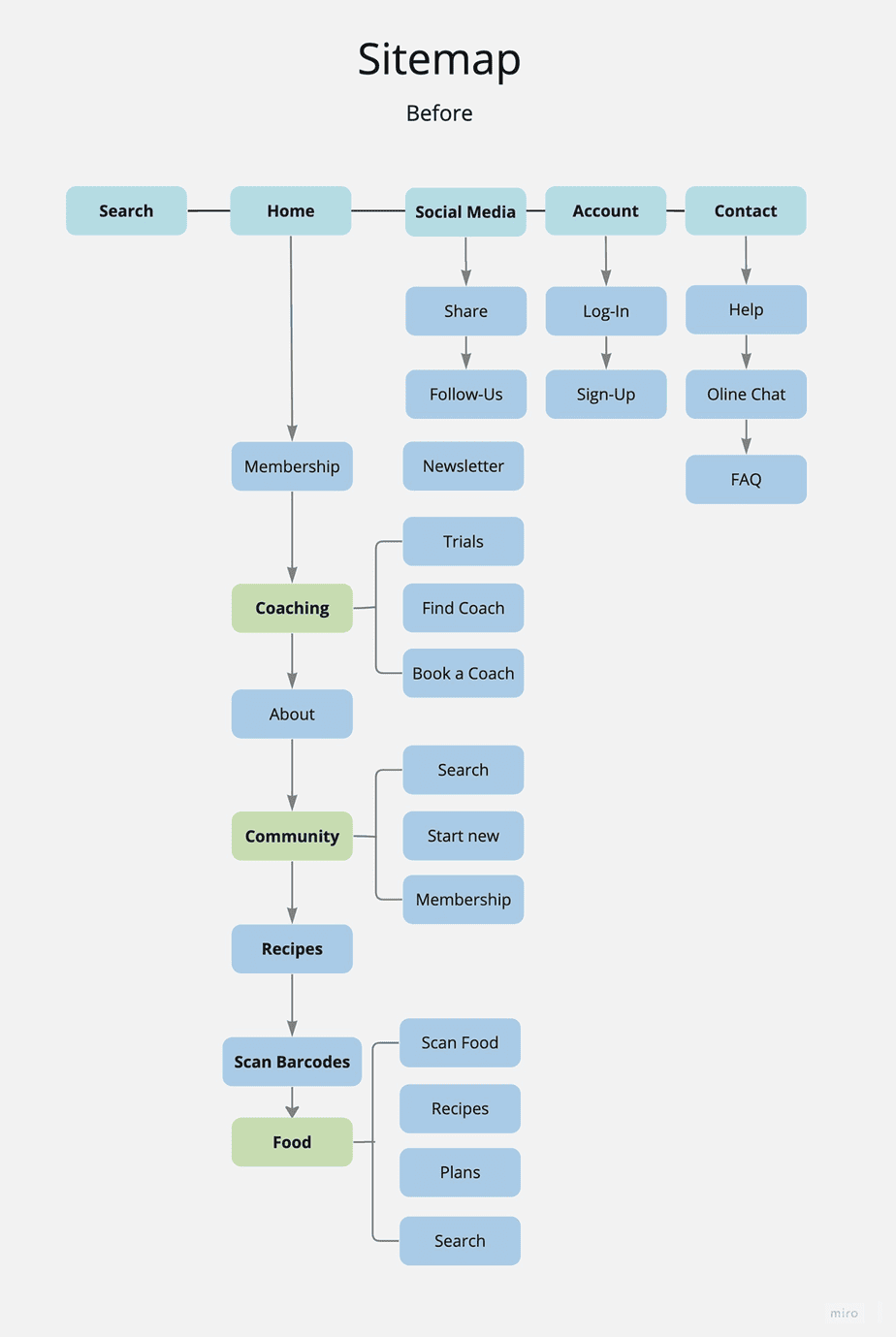
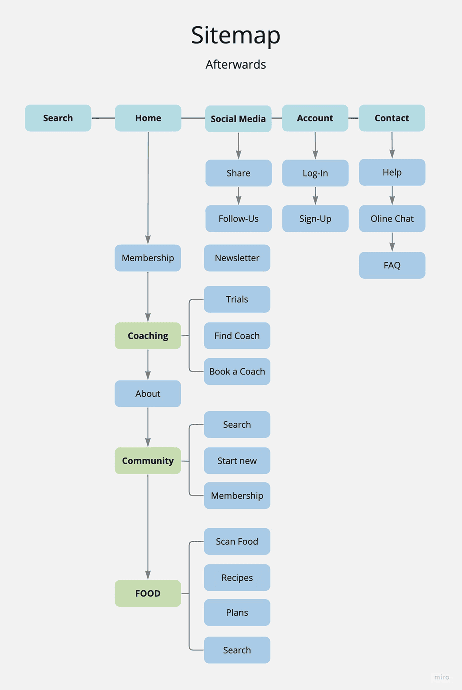
The original sitemap was assumption-based — organized around features we thought users would want. Research revealed a different mental model. Users didn't think in terms of "tracking" vs. "community." They thought in terms of what they needed at that moment.
The Four Navigation Pillars
Restructured from fragmented features into four clear user intent zones:
Coaching
Find and connect with a certified keto coach; book sessions; message directly
Community
Peer groups, buddy systems, local meetup events, shared milestones
Recipes
Macro tracking, barcode scan, recipe library, keto-verified filtering
Scan Food
Barcode scanner for instant nutritional lookup while grocery shopping
Sitemap — Before & After
The restructure wasn't cosmetic — it was a fundamental reordering based on user mental models.
Every screen traces back to a research finding
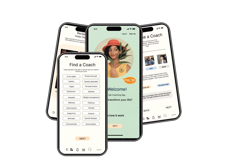
Key screens from the Keto Me hi-fi prototype — organized by the three core user journeys. Select a pillar to explore the design decisions behind each screen.
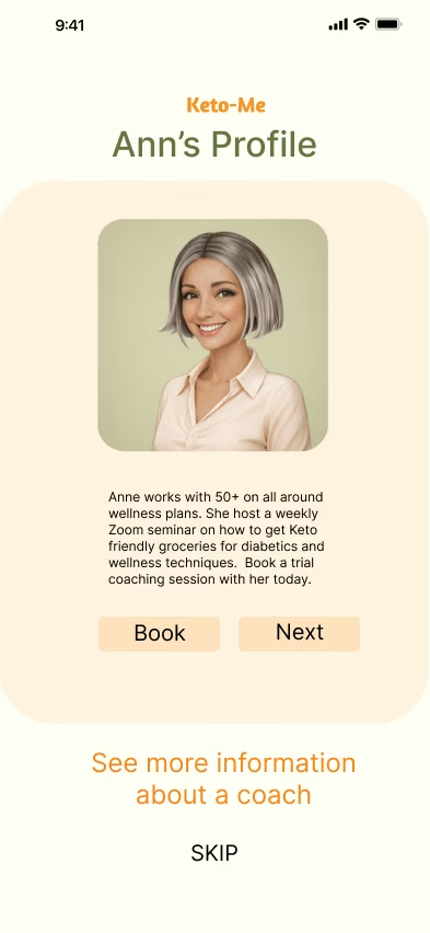
Two paths to a coach in under 3 minutes — manual search or AI bot assisted. Both converge at the same destination: a matched coach, a trial session, accountability from day one.
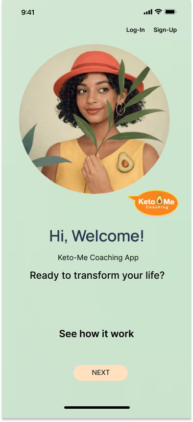
01 · Welcome
02 · Choose Your Journey
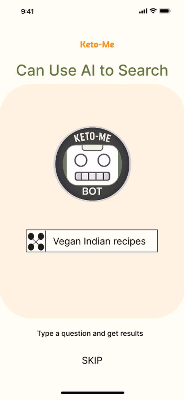
03 · AI Bot Path
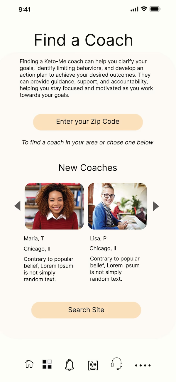
04 · Find a Coach
Design decision: The bot was designed in 2019 — before conversational AI became mainstream in consumer wellness apps. Two paths ensure every user type is served: those who want control and those who want to be guided.
Getting to a coach in under 3 minutes
The Keto Me app was designed to help users find the path that's right for them — whether that's a coach, a community, recipes, or all three — so their journey starts with a solid foundation.
Two paths were designed — a manual path for users who want control, and a bot-assisted path for users who want to be guided. Both paths converge at the same destination: a matched coach, a trial session, accountability from day one.
Designed in 2019 — Before AI Was Mainstream
The Keto Me bot onboarding anticipated conversational AI as a UX pattern by several years. What is now standard in health and wellness apps was a forward-thinking design decision I made before ChatGPT existed.
Welcome Splash
Hi, Welcome! — Ready to transform your life?
Choose Your Path
Bot-assisted search OR manual coach selection
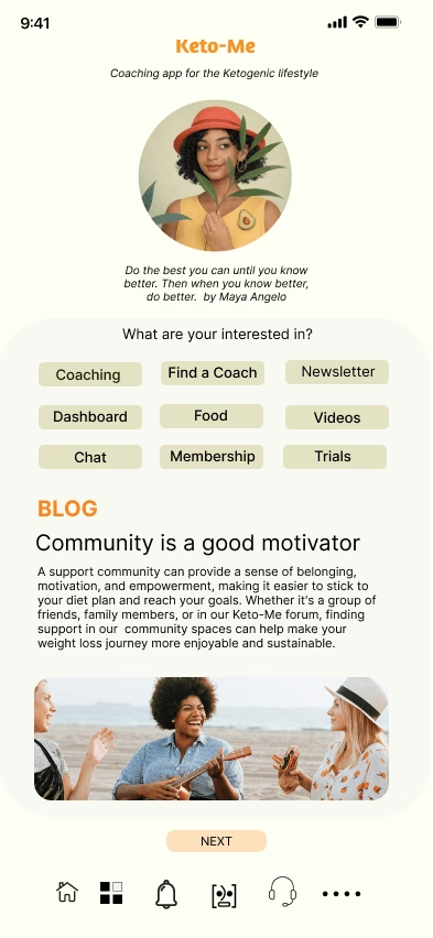
Set Your Interests
Coaching, Food, Videos, Community, Membership, Trials
Coach Connected
Trial booked. Accountability begins before the first meal.
01 · Welcome — First Screen
02 · Choose Your Journey
03 · Find a Coach — Browse
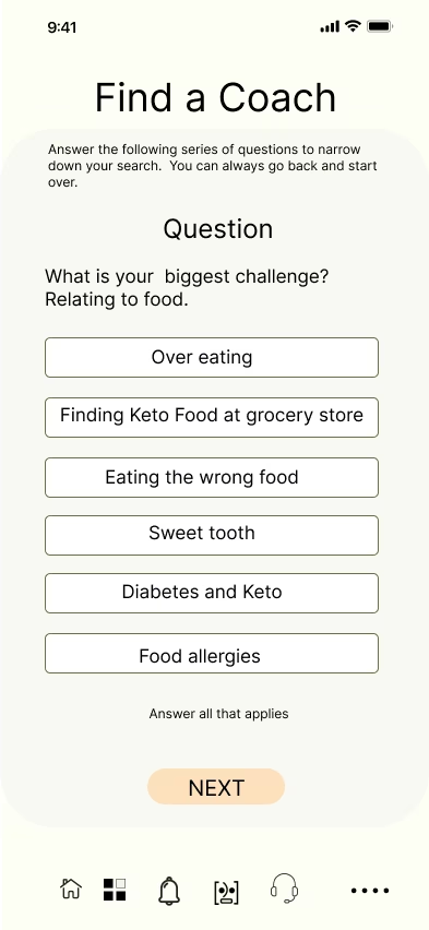
04 · Your Biggest Challenge
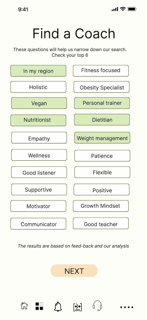
05 · What I Need in a Coach
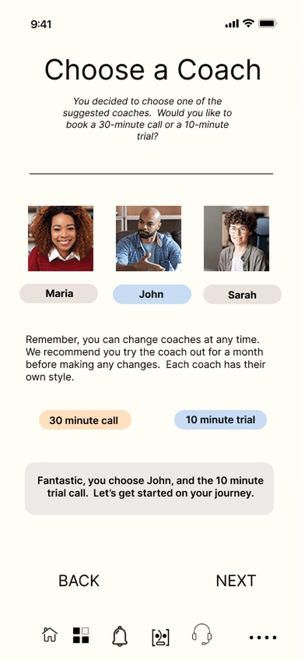
06 · Our Picks → Choose & Book Trial
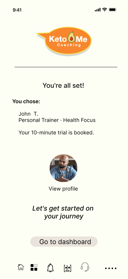
07 · You're All Set — Trial Booked
01 · Keto Me Bot — AI Search
02 · Biggest Food Challenge
03 · What I Need in a Coach
A complete support system — not just an app
Once connected to a coach through onboarding, users enter a sustained relationship — not a one-time transaction. The coaching section is designed for ongoing engagement: messaging your coach, viewing upcoming sessions, and staying connected to the community that keeps users accountable past the 30-day dropout cliff.
Coach discovery is open to every user from day one. Filtering is by characteristics that matter to them — not arbitrary categories. Trials remove commitment anxiety. Community keeps users coming back after the first week.
Loop Closed — Accountability Begins
"Fantastic, you chose John and the 10 minute trial call. Let's get started on your journey." — The system confirms the commitment. The user arrived with a need. The app delivered a relationship.
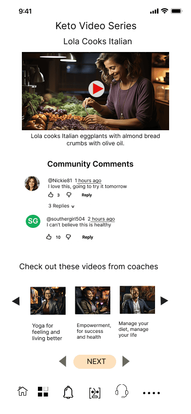
Community Comments & Coach Videos
Research → Design Traceability
Affinity map: "Need to connect with others on the diet" and "Want to speak to peers about weight loss" — this screen is the direct design response to both. Peer comments, shared reactions, and coach video content give users the connection they said they needed.
Community as Retention
Users who feel part of a group are measurably more likely to stay on their journey. Peer comments, coach videos, and shared content give users what they said they needed most — connection.
Coach Content = Trust Building
Embedding coach video content in the community feed lets users get to know coaches before committing — building the trust that makes a real coaching relationship possible.
Built for people who have been overlooked
Keto Me was built to welcome people with different backgrounds, different health challenges, and different goals. Whether you're managing diabetes, following a vegan lifestyle, or looking for recipes that reflect your culture — there's a place for you here.
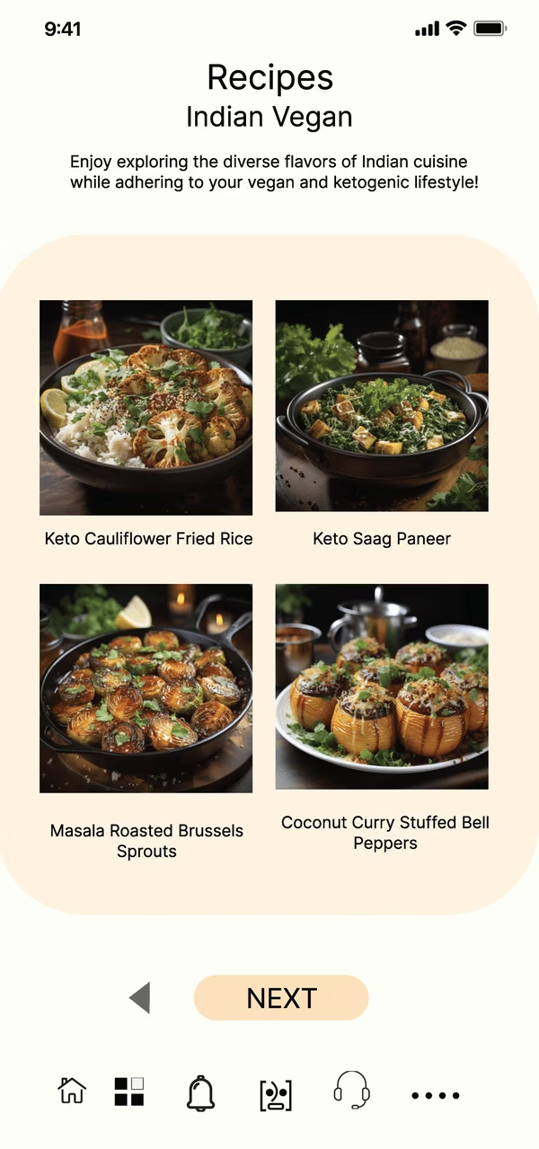
The Indian Vegan recipe screen is a deliberate design decision traceable directly to Pam's persona and a clear gap in the market. As the competitive analysis showed: "Our competitors aren't reaching outside of the mainstream. Even their recipes do not have a unique diverse cultural appeal." Keto Me was designed to change that.
Research → Design Traceability
Survey finding: Pam needs keto-aligned recipes that work with her vegan diet. Competitive gap: no existing app offers culturally diverse keto recipes. Design response: a recipe library with diverse cuisine filters built in from day one.
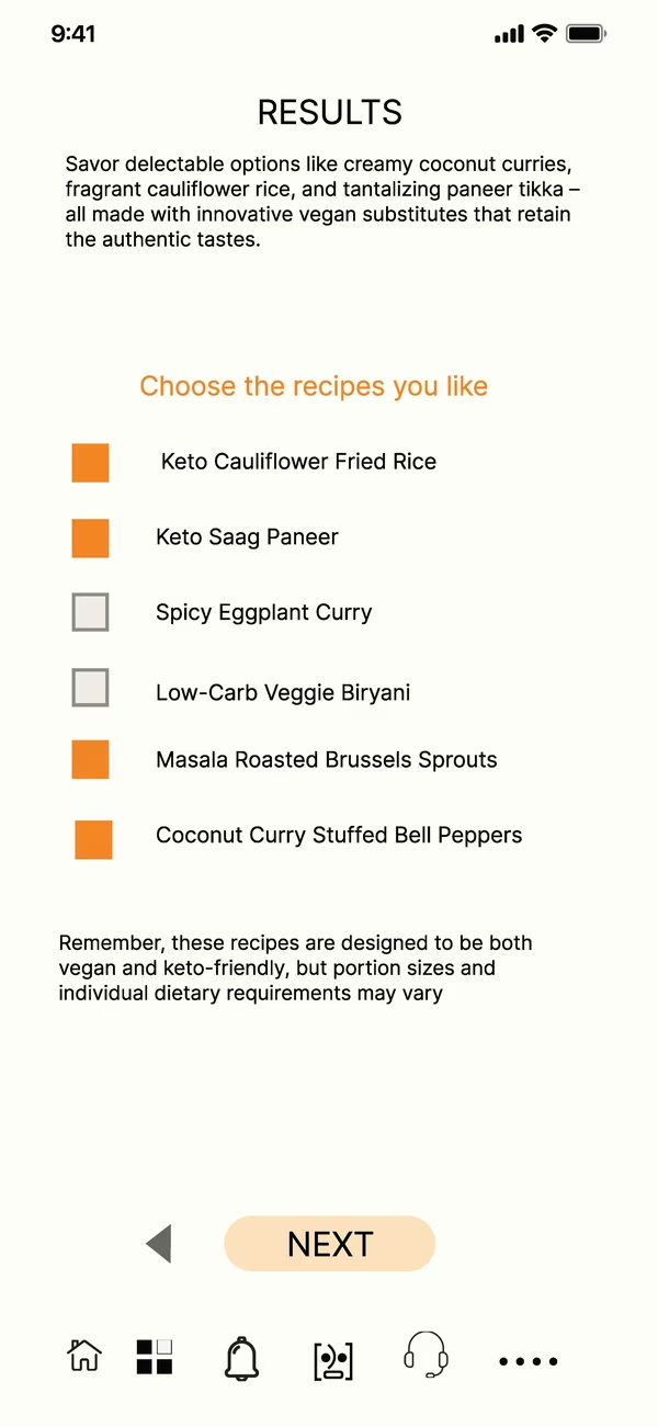
Choose Recipes You Like
Designed for Pam — vegan keto recipes that didn't exist in competitor apps.
Every decision traces back to a real finding
Keto Me wasn't designed from assumptions. Each structural choice — the navigation, the onboarding, the coaching flow, the recipe library — maps directly to something a real person said, a data point from the survey, or a gap identified in the competitive analysis.
Community-First Navigation
Placing Community as a top-level pillar — equal to Recipes — signals that connection is a feature, not an afterthought. Affinity map finding: "Need to connect with others on the diet." Design response: Community pillar in primary nav.
Coach Discovery in Onboarding
Integrating coach matching in onboarding — not behind a paywall — ensures every user has a support relationship from day one. Research finding: accountability was the #1 stated need. Design response: coach connection before first meal logged.
Accessible by Design
ADA/WCAG AA compliance isn't a checkbox — it's a brand mandate. Research finding: Brenda has diabetes and relies on her phone. Design response: accessibility requirements built into every screen from the first wireframe.
Cultural Diversity in Recipes
Existing keto apps serve one demographic. Keto Me serves everyone. Competitive gap finding: no diverse cultural content in competitor recipe libraries. Design response: Indian Vegan, diverse cuisine categories built into the recipe pillar.
AI Onboarding — Ahead of Its Time
The Keto Me bot was designed in 2019 — before conversational AI became mainstream in consumer wellness apps. What the industry now calls "AI-assisted onboarding" was a forward-thinking design decision made years ahead of the curve.
Trial Before Commitment
Coach trials remove the single biggest barrier to engagement: fear of wrong-fit relationships. Problem statement finding: users need to see the value before committing. Design response: every coach offers a free trial session, accessible from onboarding.
This was a complete system — research, architecture, onboarding, coaching, community, and recipes designed as one coherent experience. That depth is what makes it worth showing.
"The best design system is the one the user never has to think about."
Keto Me's process — from Double Diamond research through hi-fi prototypes — shows what user-centered design actually looks like: every decision traceable back to a real person's real need.