What the competition got wrong — and how research set a higher standard for Vera Blinds
A new window treatment business entering a crowded Houston market needed more than a website. They needed a digital presence that reflected the premium, design-forward work they do.
A new business with no digital footprint
Vera Blinds was launching from scratch — no existing website, no established digital presence, nothing to build from except a clear vision for the business and a Houston market full of established competitors.
Starting from zero is both a constraint and an opportunity. There are no legacy decisions to undo, no outdated patterns to work around. Every choice is intentional. The challenge is making sure the right choices get made from the beginning.
That meant the first step wasn't designing — it was discovery. A structured worksheet helped define goals, audience, brand voice, and differentiators before a single layout was considered.
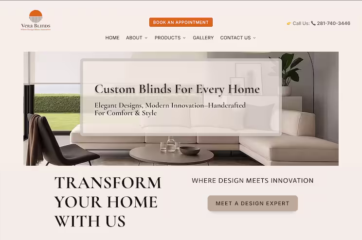 The final Vera Blinds homepage — clean, modern, and built mobile-first from day one.
A heuristics review of the competitive landscape
Before designing a single screen, I reviewed established Houston-area window treatment websites against core usability and design principles. The goal was not to find inspiration — it was to understand what the market was consistently getting wrong, so Vera Blinds could establish a higher standard from day one.
Window treatments are a design-forward, premium home service. The website should reflect the same level of care and craft. What I found across the competitive landscape told a different story.
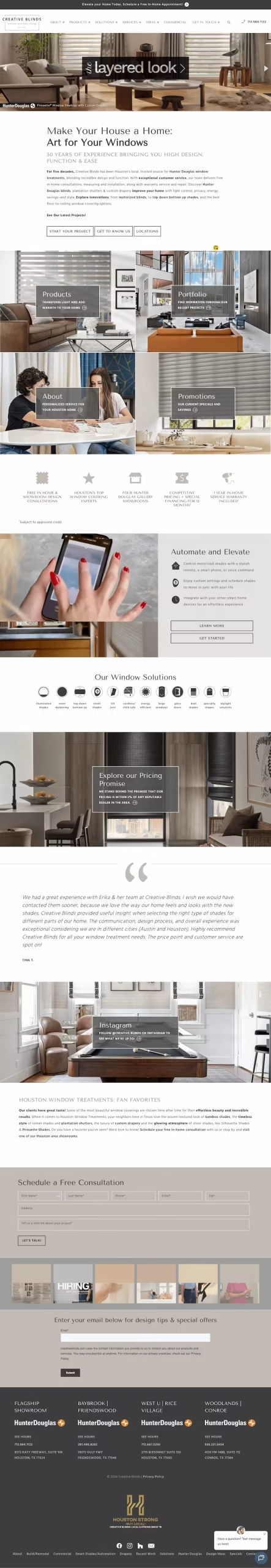 Creative Blinds
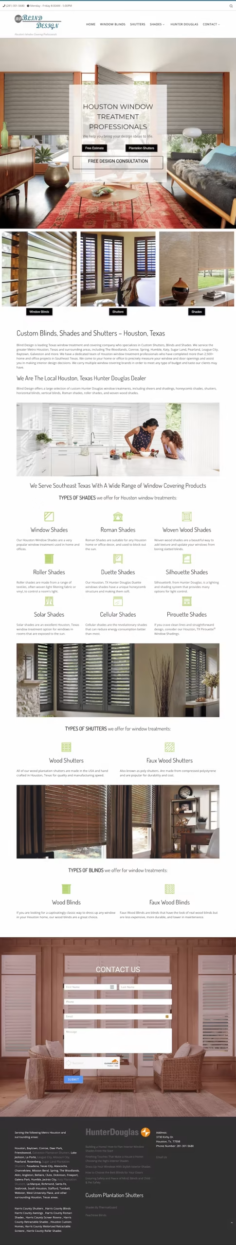 Blind Design Texas
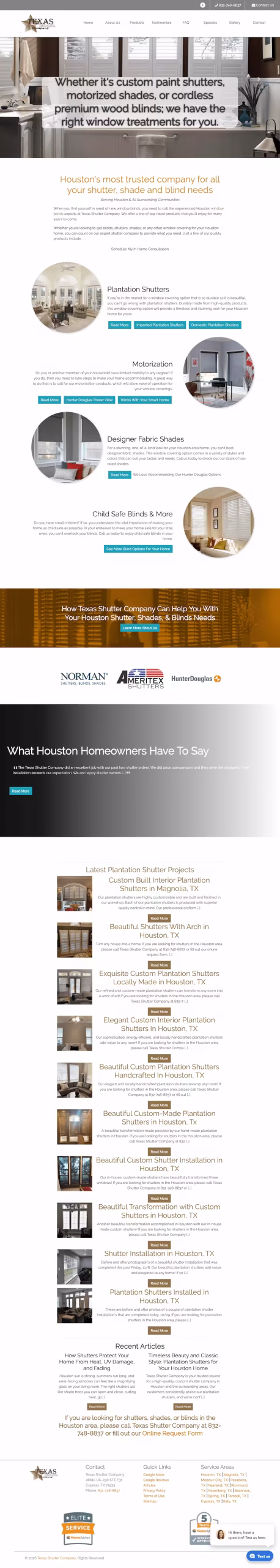 Texas Shutter Company
| Heuristic | What the Market Was Doing | Vera Blinds Approach |
|---|---|---|
| Visual Design | Dated, cluttered layouts with no clear hierarchy. Sites that don't reflect the premium nature of the service being sold. | Clean, modern aesthetic aligned with the brand: elegant, professional, high-end. |
| Navigation | 8+ top-level navigation items with no prioritization. Everything treated as equally important, which means nothing is. | Five primary items. Products grouped logically. Clear hierarchy at first glance. |
| Accessibility & Contrast | Widespread contrast failures — light text on busy backgrounds, low-contrast CTAs. WCAG AA not met across multiple sites. | High-contrast typography throughout. Transparent overlay on the hero ensures text is always legible at any screen width. |
| Plain Language | Product jargon upfront — Duette®, Pirouette®, Honeycomb — requiring prior knowledge just to navigate. | Plain language categories: Blinds, Shades, Shutters, Draperies. Users know where to go without a glossary. |
| Contact & Conversion | Poorly designed contact forms buried in navigation. No prominent CTA. Friction at the most critical conversion point. | Book An Appointment in the header on every page. Phone number front and center. Consultation is the primary action. |
| Mobile Experience | Desktop-first layouts that collapse poorly on mobile. Designed for large screens without mobile consideration. | Mobile-first from the start. Every layout decision made for mobile first, then scaled to desktop. |
 The original hero concept — the wide composition had no viable mobile path without breaking the design intent.
When the client's vision meets the mobile constraint
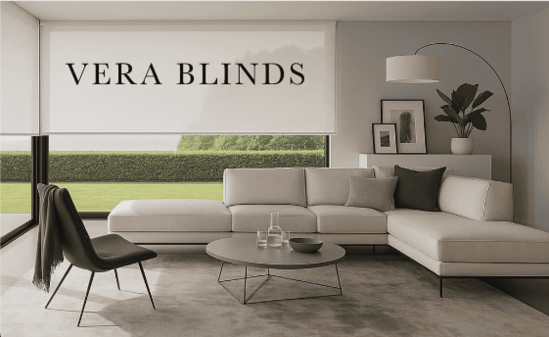
The client had a strong vision for their hero — a wide, aspirational living room scene with the Vera Blinds name displayed across a roller shade. On desktop, it was exactly right: elegant, brand-forward, visually powerful.
The problem emerged on mobile. Wide images don't translate to narrow screens. The composition that worked at 1200px wide became cropped and unreadable at 375px. Text on the blind competed with the background when zoomed. Every variation I tested created a new problem.
This is the core tension of desktop-first thinking — designing for the best-case environment, then trying to adapt down. The image the client loved had no viable path to mobile without compromising the design intent.
The research-led decision: stop forcing the image to work and solve the actual problem — legible, accessible text over a hero image at any screen width.
Leaning on research when iteration alone wasn't enough
After testing multiple image variations and ratios without a satisfying result, I stepped back from the iteration and returned to first principles. The answer wasn't in the image — it was in how text and imagery coexist in a responsive layout.
The solution: a transparent overlay banner centered within the hero. Text sits inside its own contained, semi-transparent surface — readable against any background, at any screen width. The living room scene remains the emotional backdrop. The headline and CTA are always legible. Accessibility maintained without sacrificing visual impact.
This works because it decouples text from the image. The image crops and scales across breakpoints. The text panel holds its own. Both serve their purpose independently — at every device size.
Client's original vision — striking on desktop, no mobile path.
Transparent overlay solution — works at every screen width.
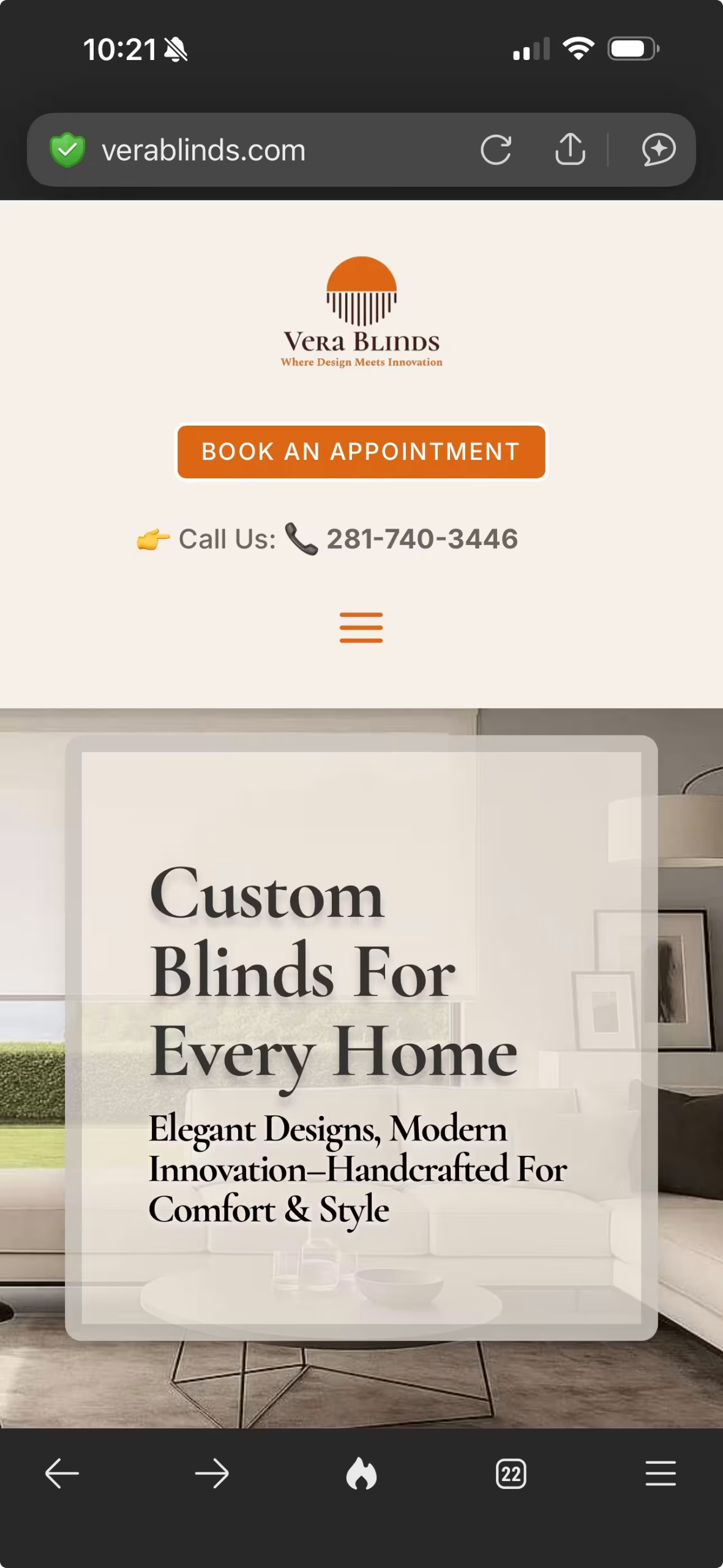 The proof — fully legible, accessible, and on-brand at 375px.
A first website that leads the market it entered
Vera Blinds launched with a digital presence that established competitors — some with decades in the market — do not have. Clean layout. Modern aesthetic. Accessible design. A navigation structure that respects the user's time. A hero that works on every device.
Mobile-First From Day One
Every layout decision was made with mobile as the primary context, then scaled to desktop — not the reverse.
Accessible by Design
The transparent overlay resolved both the responsive image problem and the contrast accessibility problem in a single solution.
Streamlined Navigation
Five primary navigation items versus the market standard of eight or more. Every item earns its place.
Conversion-Forward Structure
Book An Appointment and the phone number in the header on every page. Getting in touch is never more than one tap away.
Launch Apr 2025
Month 2 Aug 2025
Month 6
What this project reinforced about strategic web design
Competitive research is strategy, not inspiration
Looking at competitors before designing told me exactly where the bar was set — and how low it was. Eight or more navigation items was standard. Product jargon like Duette® and Pirouette® was used as category labels. Hero sections failed basic contrast. I didn't need to find inspiration — I needed to know what not to do. Every gap I found became a direct decision for Vera Blinds.
Starting from zero requires more rigor, not less
A brand new site has no safety net — no existing design to iterate on, no analytics to reference. Every decision has to be grounded in something. The worksheet is where that grounding begins — defining goals, audience, voice, and differentiators before a single layout is considered.
When iteration fails, go back to the research
I tried cropping the image to a tighter ratio. I tried a portrait version. I tried setting a separate image for mobile. Each one broke something else — the composition, the brand feel, the legibility. It wasn't until I stopped trying to fix the image and asked why it wasn't working that the answer became obvious. The image was designed for desktop. Mobile needed something different entirely. That's when the overlay solution clicked.
The website must match the quality of the work
Window treatments are a design product. A website that doesn't look premium sends a signal about the business before a single consultation is booked. The digital presence is part of the product experience — and should be treated that way from day one.
"Getting it right the first time is not about perfection. It is about making intentional decisions grounded in research — so the site that launches reflects the business it represents from day one."
— Cara Harpole