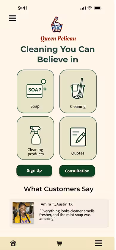
A decade of design, rooted in a disaster.
Queen Pelican began as a response to the 2010 BP Deepwater Horizon oil spill — a question about what it would take to build a cleaning platform that actually respected the environment it was supposed to protect.

The Problem
A market full of demand, and no one worth trusting.
Austin's green cleaning market had demand but no trust. Customers were already hiring cleaning services — but couldn't find a single provider that disclosed ingredients, offered online booking, or designed for the user who actually cared what went into their home. Parents worried about chemical exposure. Allergy sufferers couldn't find certified green options. Pet owners had no way to verify what products were being used around their animals. The gap wasn't desire for green cleaning — it was the complete absence of transparency in how it was delivered. Queen Pelican was designed to fill that gap.
My Role
- UX Researcher
- Information Architect
- Brand Strategist
- Usability Tester
- Mobile-First Designer
The market existed.
The right option didn't.
65% of survey respondents had already used cleaning services. The demand was there. But no Austin competitor offered transparent ingredients, online booking, or a design built around trust. Queen Pelican was designed to fill that gap.
The market wasn't waiting to be convinced. It was already buying — just from providers that didn't meet its needs. This confirmed that Queen Pelican didn't need to create demand. It needed to earn trust.
The data confirmed the demand
Average importance rating given to green cleaning by survey respondents
Listed chemical exposure, allergies, and air quality as primary advantages of green products
Gave favorable ratings when asked about green cleaning products and services
The barrier wasn't desire for green cleaning — it was the complete absence of transparency in how it was delivered. These numbers drove the decision to make ingredient disclosure and certification the first thing users see, not an afterthought buried in fine print.
What users needed vs. what existed
What users needed
- Transparent ingredient disclosure
- Online booking and scheduling
- Smartphone-accessible experience
- Customizable service options
- Trusted green certification
What competitors offered
- No ingredient transparency
- No online booking
- Desktop-only or poor mobile experience
- Fixed service packages only
- Vague "eco-friendly" claims
"Many of those surveyed had concerns about their children and pets' exposure to chemicals — yet had no idea what products their cleaning company actually used in their home."
Every gap in the table became a design requirement. Ingredient transparency informed the product detail page. No online booking drove the scheduling flow. Poor mobile experience drove the 2021 pivot to mobile-first architecture. The competitor analysis wasn't just documentation — it was the brief.
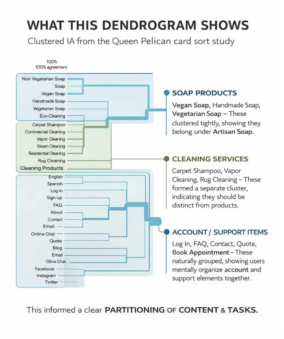
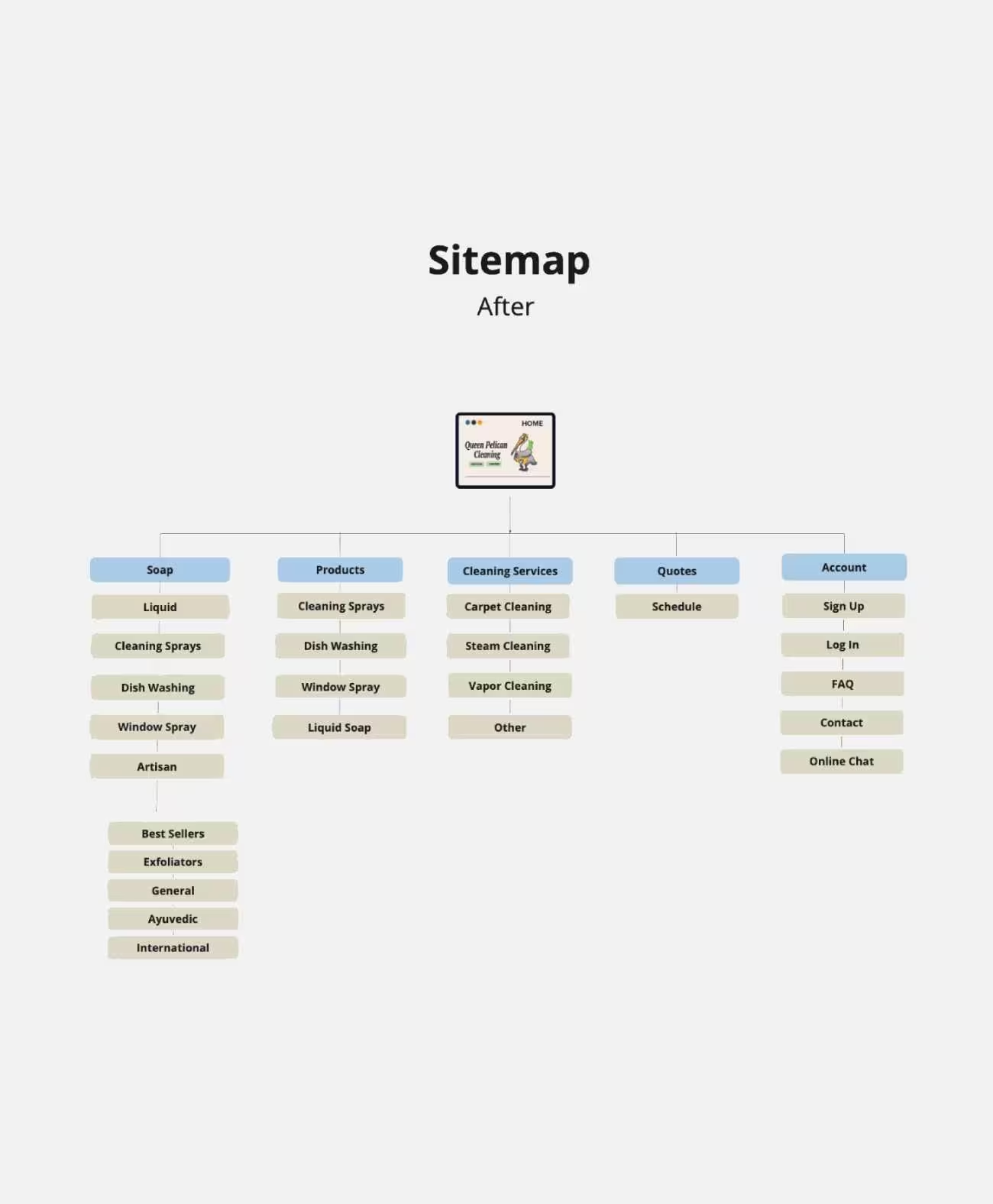
Letting users define the navigation — not the other way around
A card sort is a research method where participants group content into categories that make sense to them — revealing their mental models rather than assumptions. Before designing a single screen, 30+ cards representing all site content were sorted by real users. Four distinct clusters emerged and restructured the entire IA.
Four clear clusters emerged
Participants naturally separated soap products from cleaning products, booking from account management, and purchasing from quoting — distinctions that had not been in the original navigation structure.
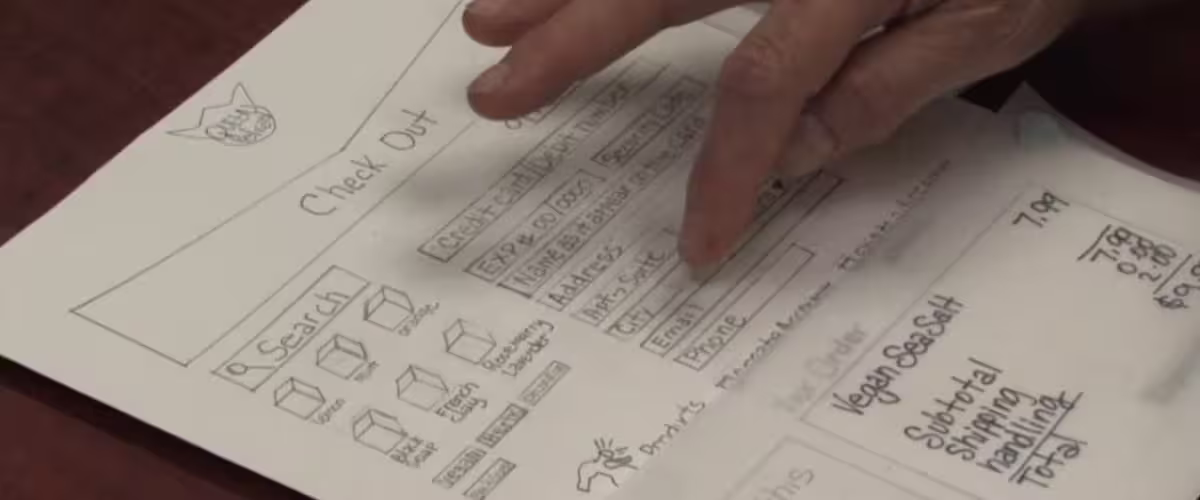
Paper prototype usability session — participant navigating the checkout flow.
Participants consistently grouped soap products separately from cleaning products — a distinction the original navigation had ignored entirely.
Dendrograms — four natural clusters with participant agreement scores.
Click to enlarge
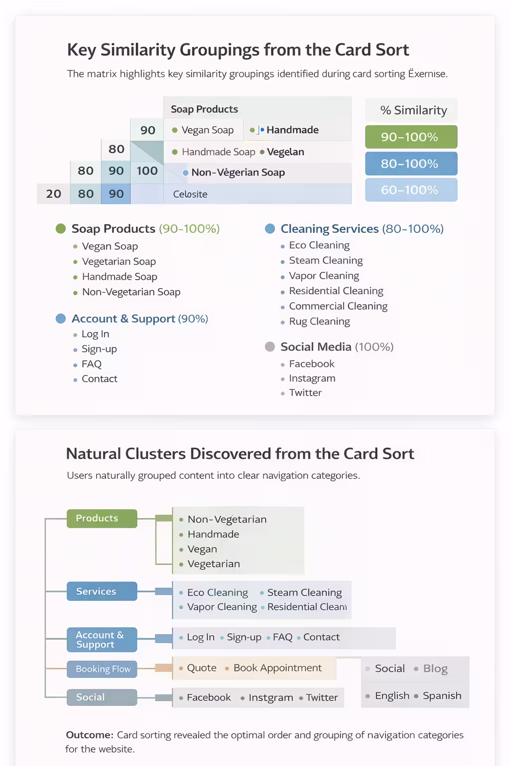
Similarity matrix — agreement scores across all 30+ content items.
Click to enlarge
"Users separated 'Purchase Cleaning Products' from 'Get a Quote' — two actions that look similar on the surface but represent completely different user intents. This single finding directly shaped the dual-path homepage design."
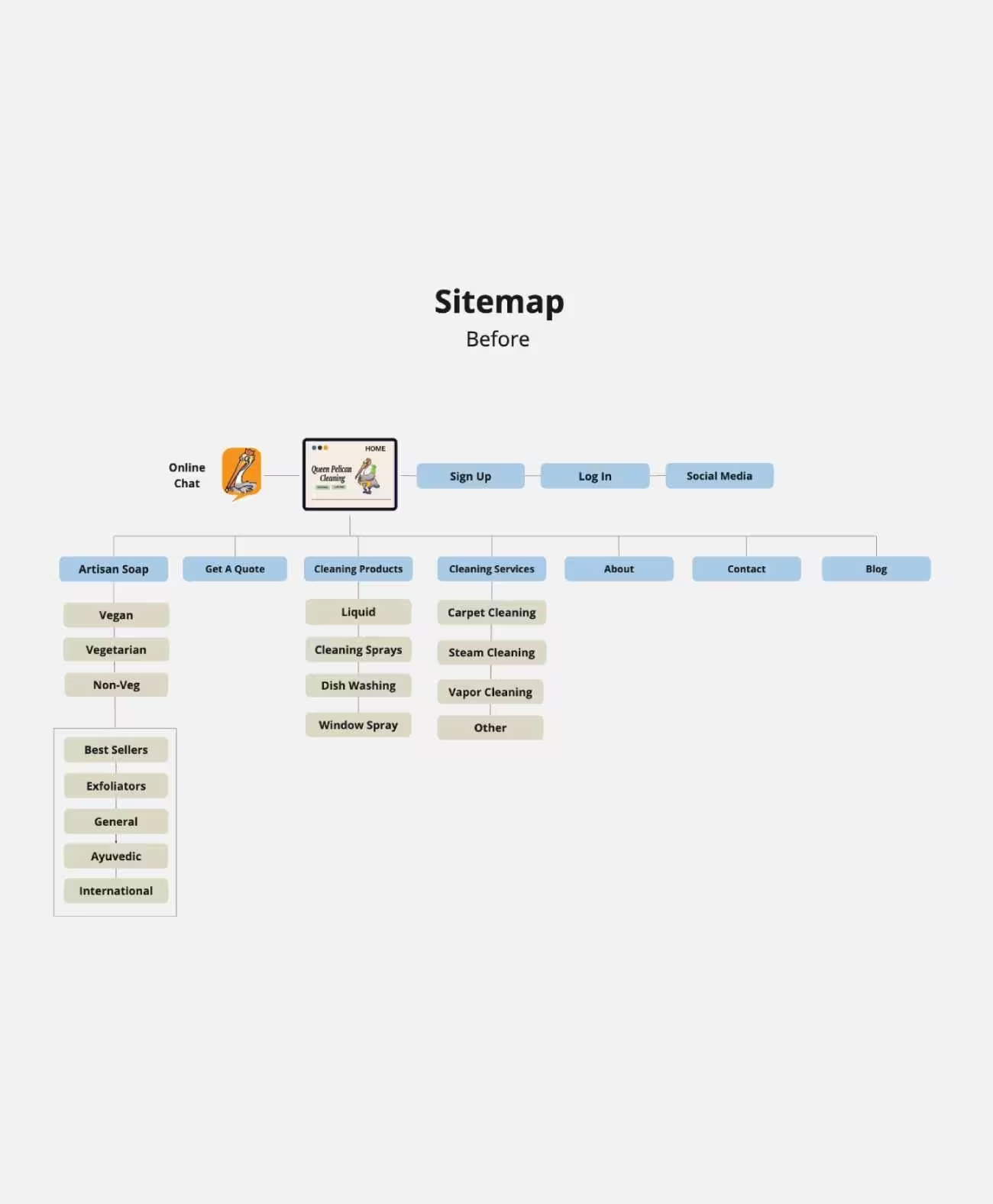
The original sitemap was built on assumptions
The card sort produced a complete reorganization — built directly from user mental models rather than designer assumptions.
Three competitors. Four principles. Two evaluations.
I conducted a heuristic evaluation of Austin's green cleaning market using four of Nielsen's 10 General Principles for Interaction Design: aesthetic and minimalist design, match between system and the real world, recognition rather than recall, and consistency in standards.
Three green cleaning companies were selected based on one criterion: their business model had to focus on green cleaning. Two of the three were re-evaluated a year later. One competitor — The Hive Green Cleaning — was no longer online at the time of the second evaluation. The longevity and web presence of competitors itself became a data point.
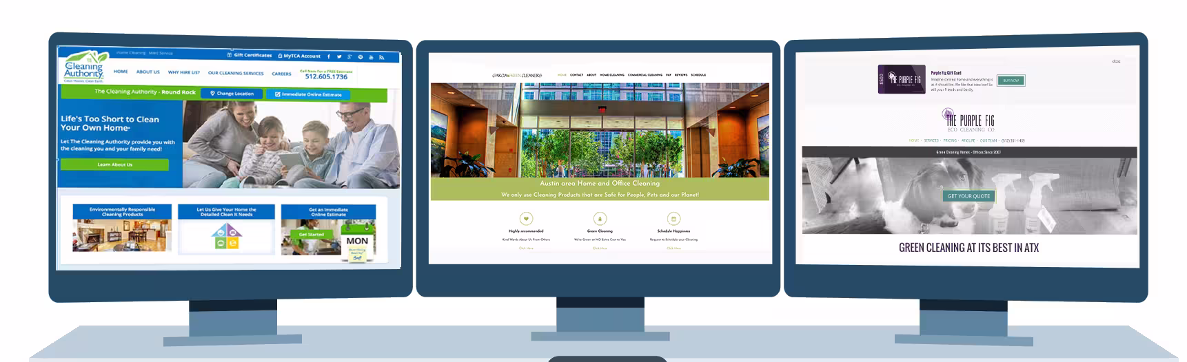
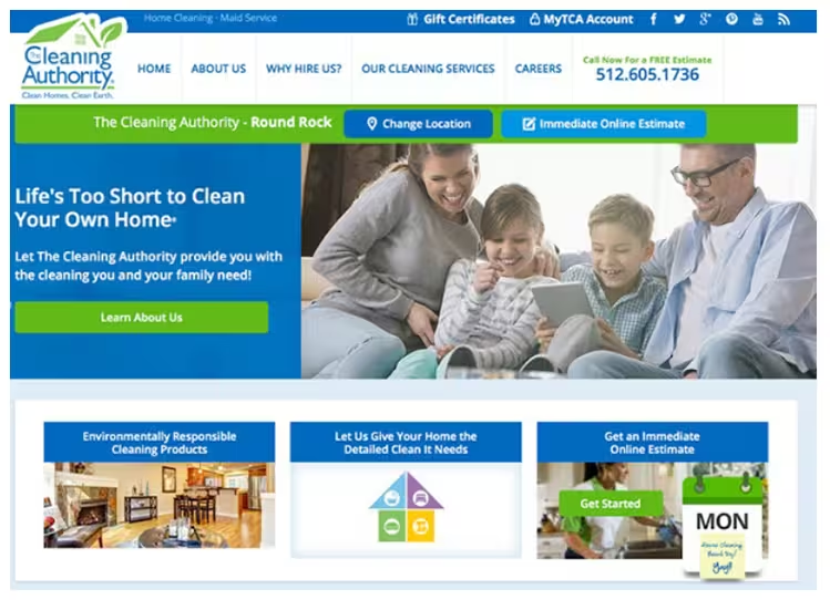
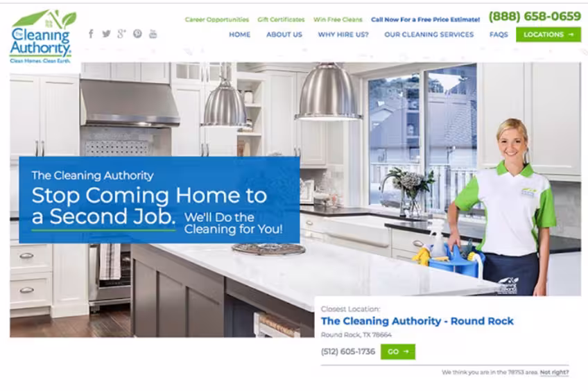
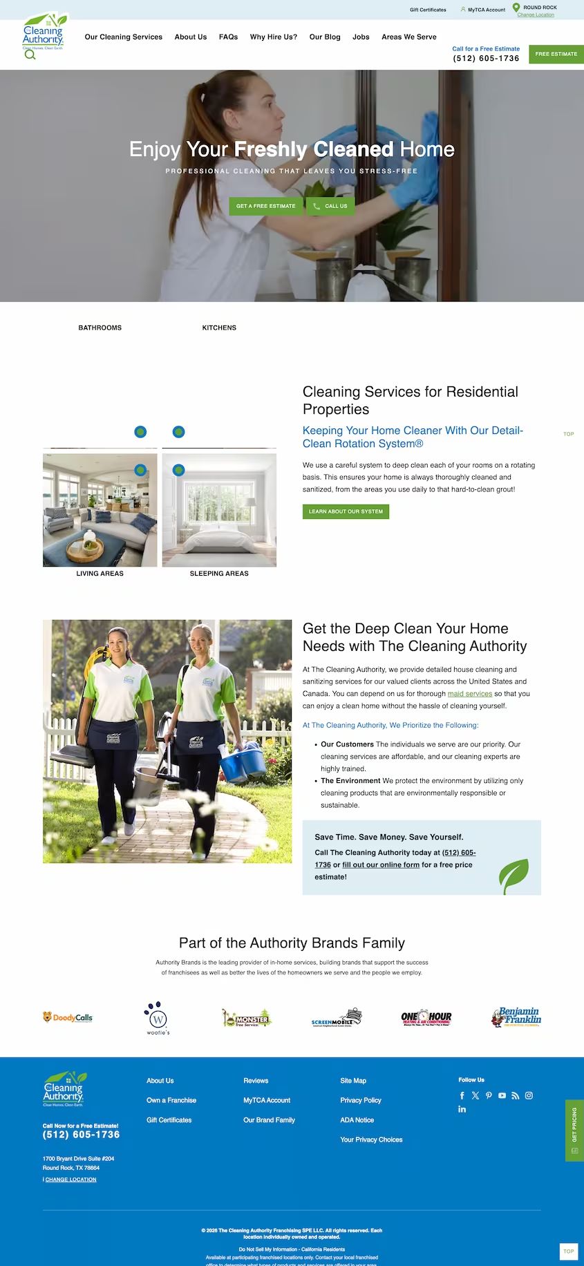
Cleaning Authority
A major regional player with a visible fleet presence in Austin. Evaluated across three iterations spanning nearly a decade — each version a visual refresh, none of them fixing the underlying UX problems. Different flavor, same friction.
Improved — but still content-heavy
The older landing page was cluttered with pop-up ads and animations that blocked content. The redesigned version eliminated the pop-ups and improved visual hierarchy significantly. The 2018 version shows clearer focus — the previous site was more content-driven than user-friendly.
Unexplained acronyms, no exit path
"MyTCA" appears in the top navigation with no explanation or definition. The login page offers no way back to the main site. "Why Hire Us" was also removed between evaluations without replacement.
Account benefits never explained
Visitors must arrive with prior knowledge of what "MyTCA" means or assume an account is required. No explanation of account benefits is provided. A growing multi-location company was using a Gmail address for a local office — a credibility gap for a professional service.
Contact page missing key information
The contact page offers only a phone number — no form, no physical address, no email. The most prominent element is a map, but it lacks a service area overlay — the most useful information for a potential customer.
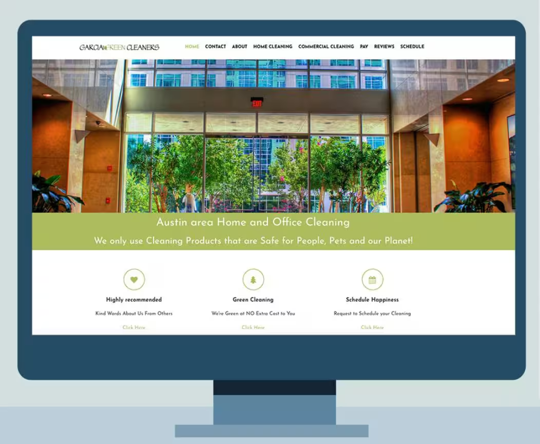
Garcia Green Cleaners
An Austin-based eco-conscious cleaning company with a good Home Advisor rating and a genuine green commitment. Garcia replaced Hive Green Cleaning in this analysis — Hive's site was taken offline and their web presence did not meet the quality threshold for meaningful comparison.
Clean landing, overcrowded below the fold
The landing page is neat and organized with a clear value proposition: "We only use cleaning products that are safe for people, pets and the planet." However, the 8-page navigation is more than standard. Hero images are generic — a mountain backdrop is a mismatch for a local Austin business.
Terminology and icon placement create friction
The Facebook icon is positioned above the logo — easy to overlook. The scheduling page asks visitors to "tell us when you would like to have your real estate cleaned" — industry language, not user language.
Unexpected pages break the user's mental model
- Facebook icon buried — easily missed
- Separate "Tip Your Maid" and "Online Store" pages are unexpected navigation items
- The Online Store page is the owner's unrelated Arbonne makeup business — completely off-brand
- No integrated scheduling with check-out — booking is disconnected from purchase
Layout, navigation, and button styles all vary
- Commercial Services and Home Cleaning pages use different layouts
- Side navigation is bulky and redundant — key pages appear multiple times
- Completely different button styles appear on different pages — no design system applied
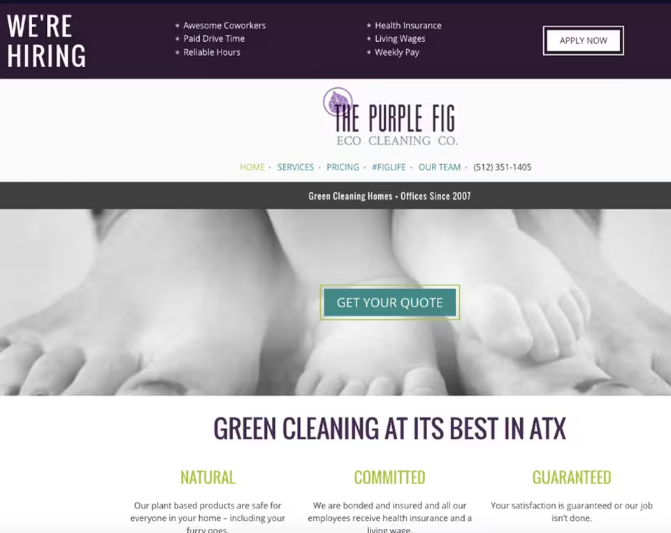
Purple Fig Eco-Cleaning
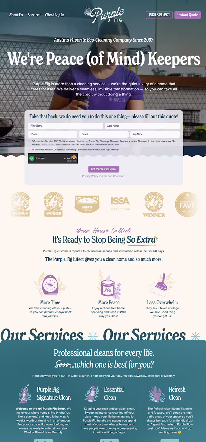
The most significant transformation of the three competitors. The 2017 evaluation identified real problems — buried navigation, confusing hierarchy, unexplained brand language. By 2026, Purple Fig had rebuilt from the ground up. Clear value proposition, instant quote above the fold, simplified nav, and a credibility strip of industry awards. They fixed exactly what the research flagged.
Beautiful design, poor organization
The landing page has beautiful colors and contrast — layers that work together elegantly. However, the navigation is placed in a non-conventional location. The $500 gift card occupies the most prominent position on the page — raising the question of whether that's truly the company's primary product or simply poor hierarchy.
#Figlife in navigation — with no explanation
"#Figlife" appears as a navigation item with no explanation. It reads like an insurance company name — users wouldn't know it's a hashtag. Searching "#Figlife" returns two other companies before this one — a discoverability and branding problem.
Gift card hidden, wording non-standard
There is no gift card link on the landing page — it can only be found buried within Services, #Figlife, and Our Team pages, and not in the same location on each. The purchase page asks users to enter a "Purchase Credit worth ($)" — the expected label is "Amount" or "Gift card value."
Sidebar placement shifts across pages
The sidebar is on the right on Services and #Figlife pages, but switches to the left on Our Team and Gift Card pages. Users must reorient their mental model on every page — a fundamental layout consistency failure.
What every competitor failed at
Across all three evaluations, one failure was consistent: none of them disclosed what cleaning products they actually used. No ingredients, no certifications surfaced upfront, no transparency about what enters a customer's home. Every competitor made users work to find — or simply never find — the information that mattered most to them. Trust was assumed, never earned.
What Purple Fig fixed — and Queen Pelican prioritized
Purple Fig's 2026 rebuild proved the market would reward clarity: a direct value proposition, instant quote above the fold, and simplified navigation. Queen Pelican took that signal further — building ingredient transparency, green certification, and online booking as first-class features from screen one, not afterthoughts buried in a Services page.
Nielsen's Principles Applied
Aesthetic & Minimalist Design
Dialogues should not contain irrelevant information. Every extra unit competes with relevant units and diminishes their visibility.
Match Between System & Real World
The system should speak the user's language — familiar words and concepts, not system-oriented terms. Information should appear in natural, logical order.
Recognition Rather Than Recall
Minimize memory load by making objects, actions, and options visible. Users should not have to remember information from one part of the dialogue to another.
Consistency in Standards
Users should not have to wonder whether different words, situations, or actions mean the same thing. Follow platform and industry conventions.
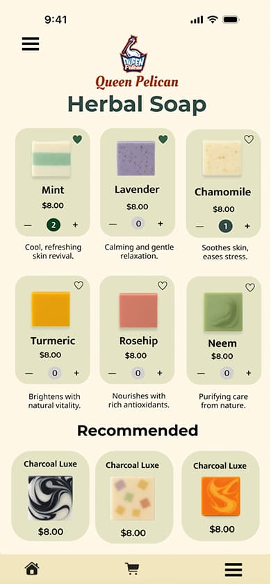
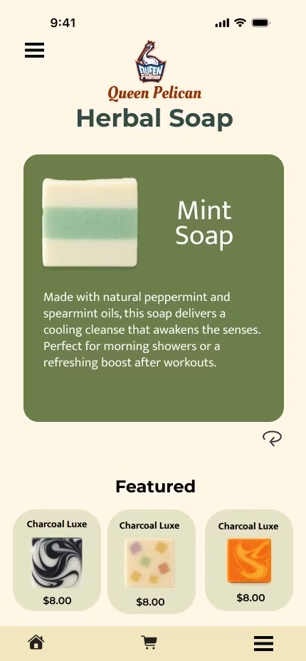
These mobile sketches explored three ideas simultaneously. First, an alternative to the hamburger menu — a slide-out side navigation that gave users a different way to move through the app. Second, a soap list page with recommendations at the bottom — three curated suggestions that led to a detail page with more information. Third, that recommendation page doubled as a soft conversion point: a newsletter signup embedded naturally for users who wanted to learn more, without occupying prime screen real estate on the main product page. All three ideas came from one principle — mobile-first means designing for the user's context, not fitting a desktop experience onto a smaller screen.
From Pencil to Pixels
Before any digital tool was opened, the Queen Pelican experience was sketched by hand — every screen, every flow, every interaction. The paper prototype was used in live usability sessions. What participants responded to directly shaped the first hi-fi desktop design.

Landing page sketch

Soap selection process sketch

Check out sketch
Designing for Choice, Not Convention
These mobile sketches explored three ideas simultaneously...

Queen Pelican Mobile App Design
These mobile sketches explored three ideas simultaneously. First, an alternative to the hamburger menu — a slide-out side navigation that gave users a different way to move through the app. Second, a soap list page with recommendations at the bottom — three curated suggestions that led to a detail page with more information. Third, that recommendation page doubled as a soft conversion point: a newsletter signup embedded naturally for users who wanted to learn more, without occupying prime screen real estate on the main product page. All three ideas came from one principle — mobile-first means designing for the user’s context, not fitting a desktop experience onto a smaller screen.
Every redesign had a reason. Here's the logic.
Queen Pelican wasn't redesigned because something looked dated. It was redesigned because the industry moved — and the research confirmed it. Each major iteration was a direct response to a shift in how users were actually behaving, and what design patterns were serving them versus getting in their way.
The Mobile Pivot
The original prototype was built for a desktop-first world — which no longer existed.
When the initial sketches and prototype were created, desktop-first design was the industry standard. That was the context. By 2021, that context had fundamentally changed — 46% of users were completing research on smartphones, and the entire industry had shifted to mobile-first as the default approach, not the exception.
The original design wasn't wrong for its time. It was right for 2017. It was wrong for 2021.
I rebuilt the architecture mobile-first — restructuring the dual-path homepage around the device users were actually holding, not the one designers historically assumed.
Removing Onboarding
Onboarding was a trend that peaked — and became friction.
The 2021 version included an onboarding flow because that was the dominant mobile design pattern at the time — walk users through your value proposition before letting them in. It made sense when apps were new and unfamiliar. By 2025, users had seen enough onboarding screens to recognize them as a barrier, not a welcome.
User feedback and behavioral patterns confirmed it: people were skipping through or abandoning before reaching the actual platform.
Onboarding was removed entirely. Four clear primary paths from screen one — no preamble, no slides, no "get started" gates. The platform earns trust through transparency, not through a tutorial.
The Mobile Pivot
Survey data showed 46% of users completed research on smartphones. The redesign shifted to mobile-first architecture. The yellow iteration restructured the dual-path homepage — separating "Book a Service" from "Purchase Products" as two equal, distinct entry points. The card sort data from 2018 finally showed up in the UI.
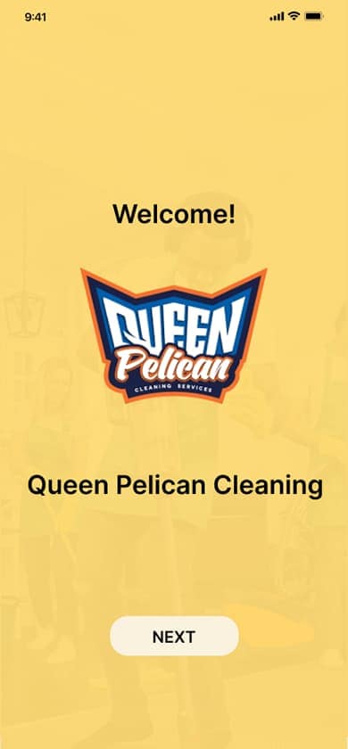
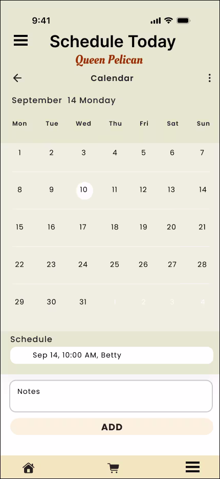
Welcome — onboarding screen 1
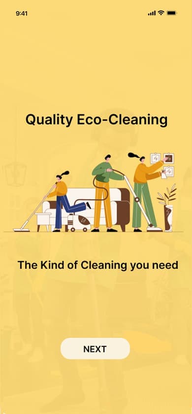
Quality Eco-Cleaning — onboarding screen 2
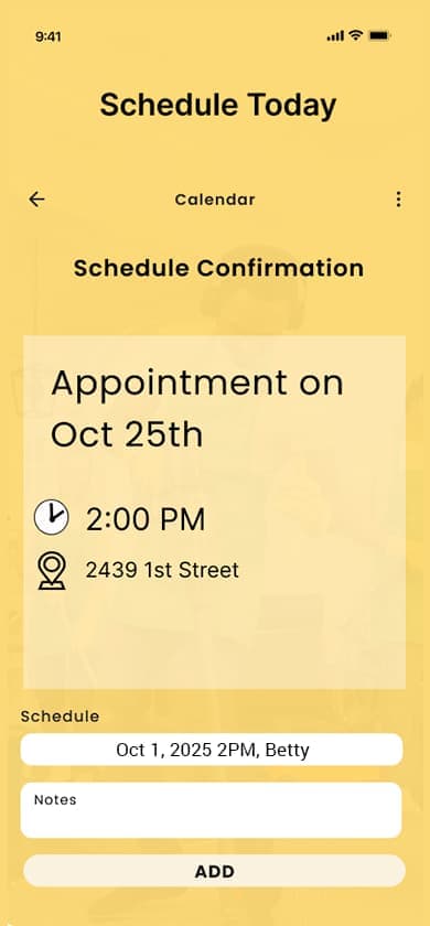
Schedule Today — onboarding screen 3
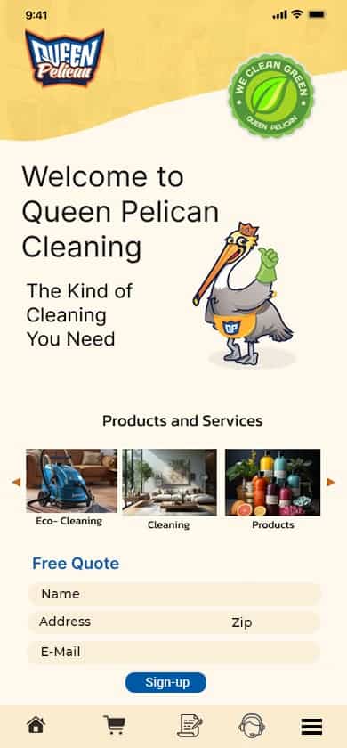
Main home page — post onboarding
The System Finally Disappears
Onboarding removed entirely. Four clear primary paths from screen one. A decade of research, iteration, and user feedback distilled into a platform that gets out of the user's way. The design doesn't announce itself — it just works.
Landing screen

Soap list page
Herbal soap product page
Soap description
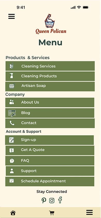
Side menu
Scheduling page
Visual Language: Designing for Trust & Calm
Every visual decision in Queen Pelican's final design was intentional — driven by user research, not aesthetic preference. The color palette, typography, and imagery style all trace back to what users said they needed to feel before they would book a cleaning service or purchase a product for their home.
Deep greens and soft neutrals were chosen to evoke environmental cleanliness and medical-grade transparency — not the aggressive branding of conventional cleaning products. The palette signals safety without being clinical, and sustainability without performative greenwashing.
A refined serif (Playfair Display) pairs with a clean, legible sans-serif (Source Sans 3) — the serif carries authority and warmth for headings and brand moments, while the sans-serif handles all functional text with clarity. The pairing was designed for Karen's demographic as much as Gina's: readable at every size, on every device.
Visuals prioritize what goes into a home over how a home looks after cleaning. Botanical ingredients, glass bottle packaging, and cleaning tools in natural environments were chosen over aspirational staging — a direct response to what users said mattered most: knowing what products are being used around their children, pets, and allergy-sensitive family members. A glass bottle doesn't just look sustainable — it signals refillable, chemical-conscious, and premium without being performative. Users couldn't trust what they couldn't see. The imagery makes it visible.
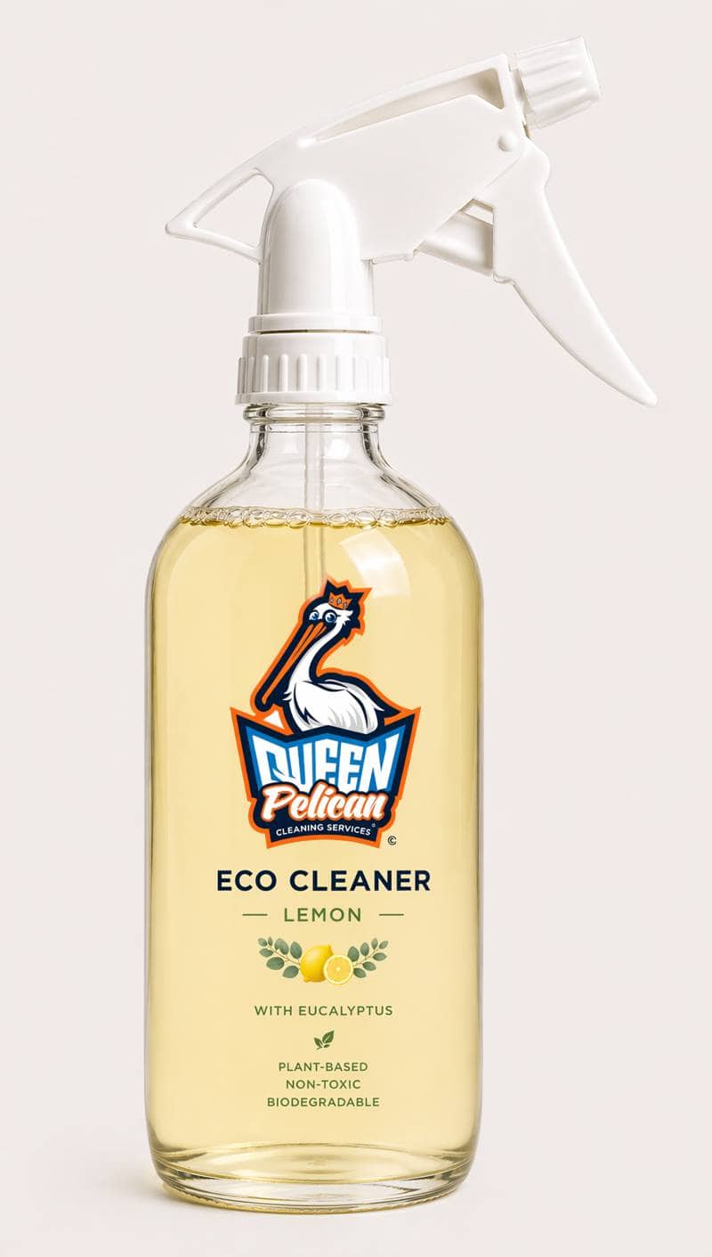
Transparency in a bottle.
The Queen Pelican Eco Cleaner — Lemon with Eucalyptus — is what the research asked for: plant-based, non-toxic, biodegradable, and packaged in glass so the product itself communicates its values before a single word is read. This isn't aspirational branding. It's the design philosophy made physical.
"Users didn't need the platform to look beautiful. They needed it to look trustworthy. Those aren't the same thing — but designing for trust produced something beautiful anyway."
From Research to Resolution: Ten Years of Design Decisions
Three major iterations across a decade. Each one driven by a shift — in the industry, in user behavior, or in the research. The design didn't evolve because something looked dated. It evolved because the evidence demanded it.
Full desktop nav bar across the top. Conventional layout designed for mouse and keyboard — the industry standard of the time.
Single entry point. Users navigated through a traditional menu. The design assumed exploration rather than direct intent.
Desktop-first was the standard. Paper prototypes tested in live usability sessions. Right for 2015 — and the research would eventually prove it needed to change.
"Users separated 'Purchase Cleaning Products' from 'Get a Quote' — two actions that look similar but represent completely different intents. The navigation didn't reflect this at all."
Hamburger menu — mobile-first architecture. Navigation collapsed to preserve screen space. Slide-out side nav explored as an alternative.
Dual path introduced — "Book a Service" and "Purchase Products" as two equal, distinct entry points. The card sort findings finally visible in the UI.
46% of users completing research on smartphones. The industry had moved to mobile-first. The original design was right for 2017 — and wrong for 2021.
"The mobile pivot wasn't a redesign for aesthetics. It was a response to how users were actually behaving — and a correction that the research had been pointing toward for three years."
No onboarding. No hamburger required. Four clear primary paths visible from screen one — the homepage is the navigation.
Cleaning service, soap products, scheduling, and account — all surfaced immediately. No gates, no upsells, no tutorials. Direct and respectful of the user's time.
Onboarding was a trend that peaked and became friction. By 2025 users recognized it as a barrier. Behavioral data confirmed abandonment. The trend was retired.
"Respecting the user's time is a design decision. Every onboarding screen, every upsell, every 'get started' gate is a tax on attention. Removing them was a direct response to what a decade of research kept saying."
"The design didn't get simpler because simplicity is trendy. It got simpler because a decade of research kept pointing to the same answer: get out of the user's way."
What I learned. What I'd do differently.
Design is a never ending process that evolves over time. It depends on users' needs, the latest improvements in features and technology. We listen to what our users say and make the adjustments. Looking back on nearly a decade of iteration, there are things I'd approach differently, features I'd revisit, and a larger vision for where Queen Pelican could go.
While cleaning companies existed, very few were built around a fully eco-first, transparency-focused model. That meant fewer established design patterns to reference and more original decisions to make — both a creative advantage and a research challenge.
Users wanted simplicity. The industry kept pushing conversion tactics — pop-ups, upsells, onboarding flows. Holding the line on a user-first approach while keeping the design current wasn't always easy. Time eventually made the decision for me: the trends faded and the user research was right.
Even design schools were teaching onboarding as standard practice at the time. I followed it. In hindsight it was friction, not welcome. The data confirmed it — and removing it was the right call.
Early iterations didn't account for users with disabilities. That changed — but it should have been a first-class consideration from the start, not a later addition.
The hardest part of the 2021 pivot was discarding desktop assumptions entirely. It wasn't about shrinking the screen — it was about rebuilding the logic from scratch for a completely different context.
A full WCAG audit focused on Karen's demographic — Baby Boomers who may have vision or motor challenges. Touch targets, contrast, screen reader compatibility, and font sizing all need formal testing rather than assumption.
Early in the design process I experimented with a near-fully voice-activated layout designed specifically for blind users — very minimal, very direct. It never made the final cut. That work deserves to be finished.
The chatbox was an early idea I thought was business-friendly — and ahead of its time. Now that conversational interfaces are mainstream, it's worth building properly into the platform as a service and support tool.
The "Book a Service" vs "Purchase Products" split was driven by card sort data. I'd want to test whether the current framing and placement is producing the conversion split we'd expect — and optimize from real usage data.
Usability participant Lynn said she wanted a clear path without having to search or figure things out. The 2025 design solved that. Every future iteration should be held to the same standard — if Lynn has to think, the design isn't done.
Queen Pelican has always been more than a platform.
The digital experience was designed to solve a specific problem — transparency and trust in the green cleaning market. The research, the users, and the design thinking that shaped this platform point toward possibilities that extend well beyond the screen.
"I want a clear path — I don't want to have to search and figure things out."
— Lynn, Usability Participant"Queen Pelican was inspired by the BP oil spill — but this closing is about the journey that followed."
Queen Pelican was inspired by the BP oil spill — but this closing is about the journey that followed.
It was a journey of learning and making decisions. Of watching trends and knowing when to follow them and when to hold back. Of discovering how important user feedback really is—not in theory, but in practice, when something a participant said in a prototype session changed the direction of the entire design.
Along the way, I learned to balance my own ideas and innovation with what the research was telling me, while holding myself back from jumping on a trend before I had the evidence to support it. This wasn't about creating something pretty. It was about creating something user-friendly, functional, and right for Queen Pelican as a product with a mission.
What makes this case study different is that I kept going. I listened to my inner voice. I researched. I wasn't afraid to change direction when the time came.
The desktop version came first. From that came mobile-first. From that came onboarding. And from all of that came the final design—simple, direct, and shaped by what people actually said in the prototype stage. Lynn and others gave me insights I wouldn't have reached alone. Users aren't just bodies for a test. Their words matter.
Looking back, I would push further on some of my earliest ideas—voice-activated interactions, chatbot systems—before they became trends. Instead of choosing one direction, I would run two in parallel: one driven by instinct, one informed by research, and let the results guide the outcome. That balance is where I do my best work.
Going forward, I don't want to be locked into any one approach or trend. I want to stay open—to new technology, to user feedback, and to the freedom of designing first, then validating. I want the agency to use my instincts, and the discipline to test them.
Listen. Learn. Design.